Background
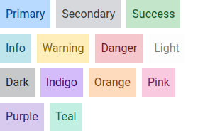
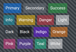
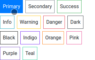
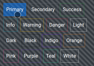
Basically, the background color palette was increased and several responsive utilities were added.
 State colors
State backgrounds inspired from Bootstrap alerts and can be used to identify block state.
 Contain size
This utility implements background-size: contain css style which can change size of background image to scale the width and height in an element.
 Image full width
Mostly used for creating full width hero headers with background image and implements background-size: cover css style.


