Button
Responsive button sizes, custom colors and shapes can make buttons special and recognizable.
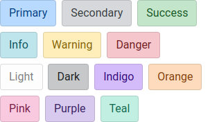
More contextual button colors diversify their place of application.
Modern outline buttons implementation with more range of colors.
Change button color on hover just with add custom class.
Make any button variant active style.
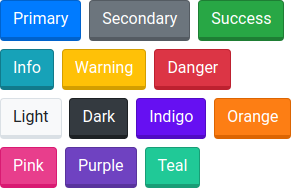
3D buttons inspired by Lumen Bootswatch template.
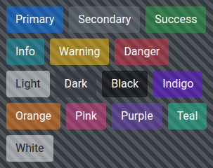
Transparent buttons with opacity in the range from 0.1 to 0.9.
State buttons inspired by alert component colors and can add additional contextual sense.
Standard buttons can change only 3 sizes without responsive behavior, with this component you can do it now.
Circle buttons inspired by material design buttons.
Pill buttons better than rounded-pill utility, because they can work with button groups.
Control block buttons on different devices.
Button with progress indicator.