Form
Your form may take on an unusual style and be used with more components than before.
 Input sizes
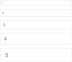
Form input sizes replaced by number start with 1 and text sizes like sm, md, lg replaced by responsive breakpoints.
Your form may take on an unusual style and be used with more components than before.
 Input sizes
Form input sizes replaced by number start with 1 and text sizes like sm, md, lg replaced by responsive breakpoints.